Call Center Application
description
We redesigned an internal customer service application for a Financial Services department, enabling increased adherence to business processes while lowering call handling time.
MY ROLE
As project lead, I was responsible for stakeholder interviews, user interviews, content audits, and captured the findings in user stories / scenarios. I also ran multiple in person focus groups in the call center.
CHALLENGE

What is the Financial Services department?
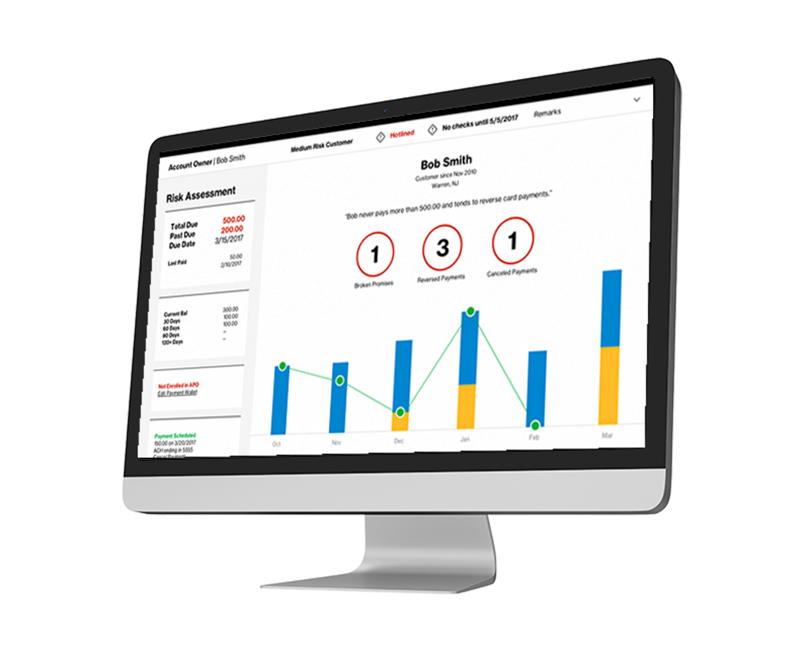
The financial services team is responsible for collecting payment from customers that have overdue balances. A majority of their work is in assessing the customer’s profile to decide how much and how aggressively to collect.

The framework before the redesign with long lists of links and functionality packaged into one size fits all components. The financial services team only needs a subsection of what is displayed (in yellow).
Why did we redesign their application?
While the financial services team has targeted responsibilities, the application it uses was designed to support multiple workgroups and 100+ functionalities. That means all information is available all the time, regardless of whether agents need it. Agents had to rely on their memory to find the right screens to use and their training to follow the business process, which in turn led to longer calls and inconsistent customer experiences.
The goal was to roll out a pilot to the first call center within six months.
research
Defining the Scope
We first broke the functionality into manageable sprints by defining the scope through stakeholder interviews. I hosted daily working sessions with our business partners, call center supervisors and the training team to identify metrics for success, required features and feature dependencies.
Understanding the Problem
With the roadmap defined, we needed to find the pain points agents were facing for specific features. While we weren’t able to meet face-to-face at the time, we were able to invite reps with varying backgrounds and tenure to our grooming calls each day to walk through their likes and dislikes.
Armed with their feedback, I created task flows and user scenarios to guide the design process.

The flows cover variations that can occur by the customer type (ex. Consumer vs. Business), the caller’s role (what permissions they have) among other factors.
DESIGN
We also took the business and agent considerations to form the design’s guiding principles: present the right information at the right time, present it in the agent’s language, and use guided flows to provide next steps!
Business Considerations
Shorter calls and strict adherence to business processes because calls and lawsuits cost money
Agent Considerations
Intuitive interface as there is no time to “discover” functionality during high pressure calls
Other members of the team created the final designs (not pictured), while I participated in the design critiques. These are the highlights:
Landing Page: Condensed information across 7+ screens into one screen
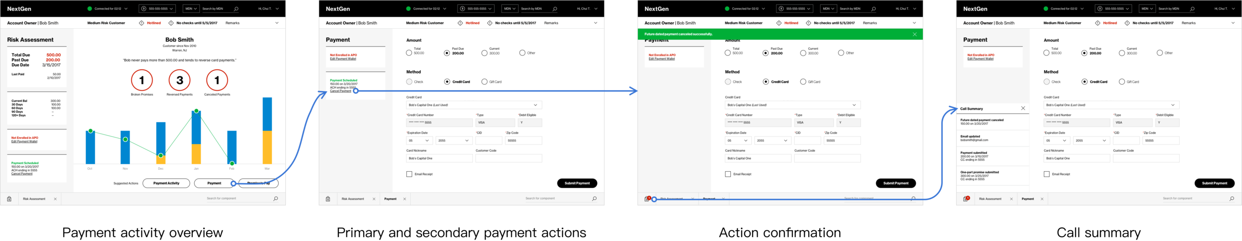
Payment and Payment Arrangements: Introduced a guided flow based on business rules and automated parts of the process
My ideas for future framework enhancements
Testing
The designers validated their wireframes via remote focus groups. After the pilot went live, I gathered feedback in person at the call center.
Remote Session Findings
The remote sessions yielded mostly positive feedback with a few suggestions for label changes. They were great for gathering anecdotes to support design decisions in case they were challenged later on.
Live Session Findings
The live sessions both revealed lessons in running focus groups as well as items to add to our roadmap. I learned to create focus groups with a mix of users to avoid skewed feedback and spark discussion. We uncovered unhappy path scenarios where the experience could be improved, and that agents were avoiding using features in certain flows, not because they could not locate them, but because of reasons that could be easily resolved with smarter design.
I communicated these findings back to the larger team including development and testing so they could work their magic on them for the next sprint.
outcome
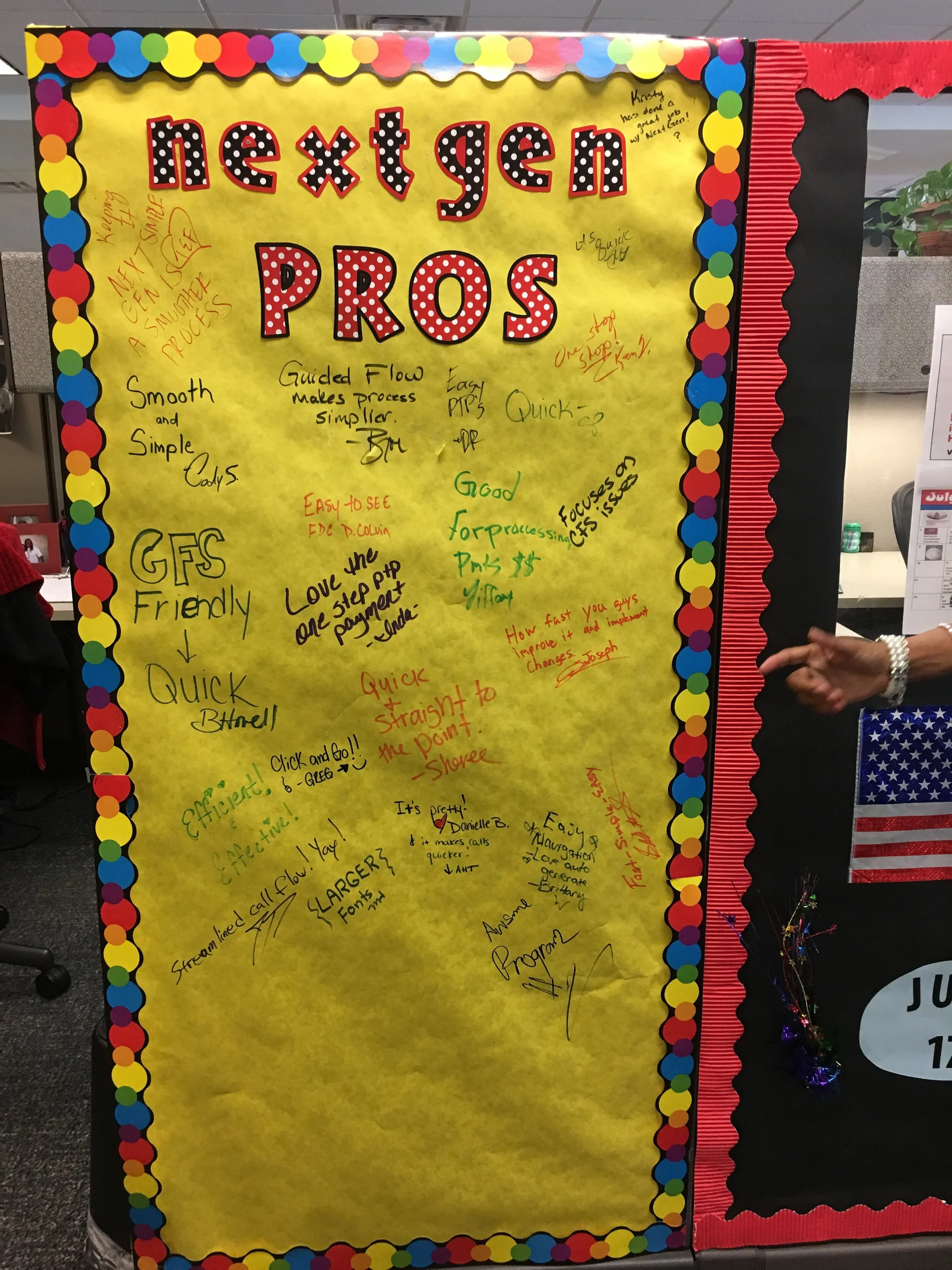
A financial services rep cubicle wall decorated with reviews on the app.
The application redesign rolled out on time to ~1K reps across all of the financial service team locations, moving past the pilot stage.
We met our goals of reducing call handling time while adding steps to enforce business rules and also received great feedback:
I like it. Quick. It’s so quick it’s like I forgot to do something.
It was epic. It took two minutes to take phone calls.
I like that I don’t have to go to five different screens to piece together the [customer] story.
Keep reading: