Predictive Dashboard
description
We designed a dashboard that predicts whether a manufacturing process will have defects and prompts operators to take specific actions to prevent them in real-time.
MY ROLE
As lead designer, partnering with data scientists and materials engineers, I used customer journey mapping and rapid prototyping to help drive the requirements discussion for this innovation project.
CHALLENGE

I was told to compare the manufacturing process to baking a cake. At the plant, they create and test formulas then apply the perfected formula to products, like following a recipe to bake a cake. The operator observes the manufacturing process through a small window in the machinery, relying on their experience to look out for indicators of potential issues. If needed, they make adjustments using a control panel. At the end of each run, samples of the output are sent to a lab to check for defects, with a turnaround time of a month.
The goal of the dashboard is to:

Increase Accuracy
Bring consistency & accuracy to the manufacturing process

Decrease Sampling Time
Bring sampling time down to daily or monthly for cost savings
research
We started by outlining the user journey to understand their goals, environment, and where the dashboard fits in. How might we get operators to adopt this tool and use it effectively?

Genericized journey map of the manufacturing process
Key Takeaways:
The dashboard will be displayed on a large, overhead monitor, 5m away from the operator
The operator is already interacting with multiple screens and two sets of keyboards and mice
Manufacturing happens 24/7 so operators work in shifts
Design Impacts:
Don’t display too much detailed information that cannot be seen from far away
Limit the need for user input or too many clicks to avoid overwhelming the operator
No personalization or login/logout is required
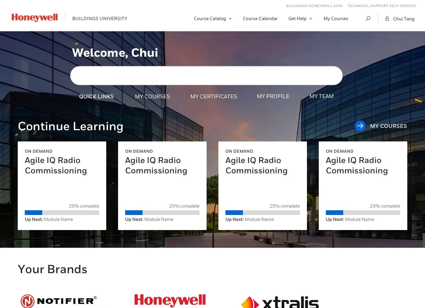
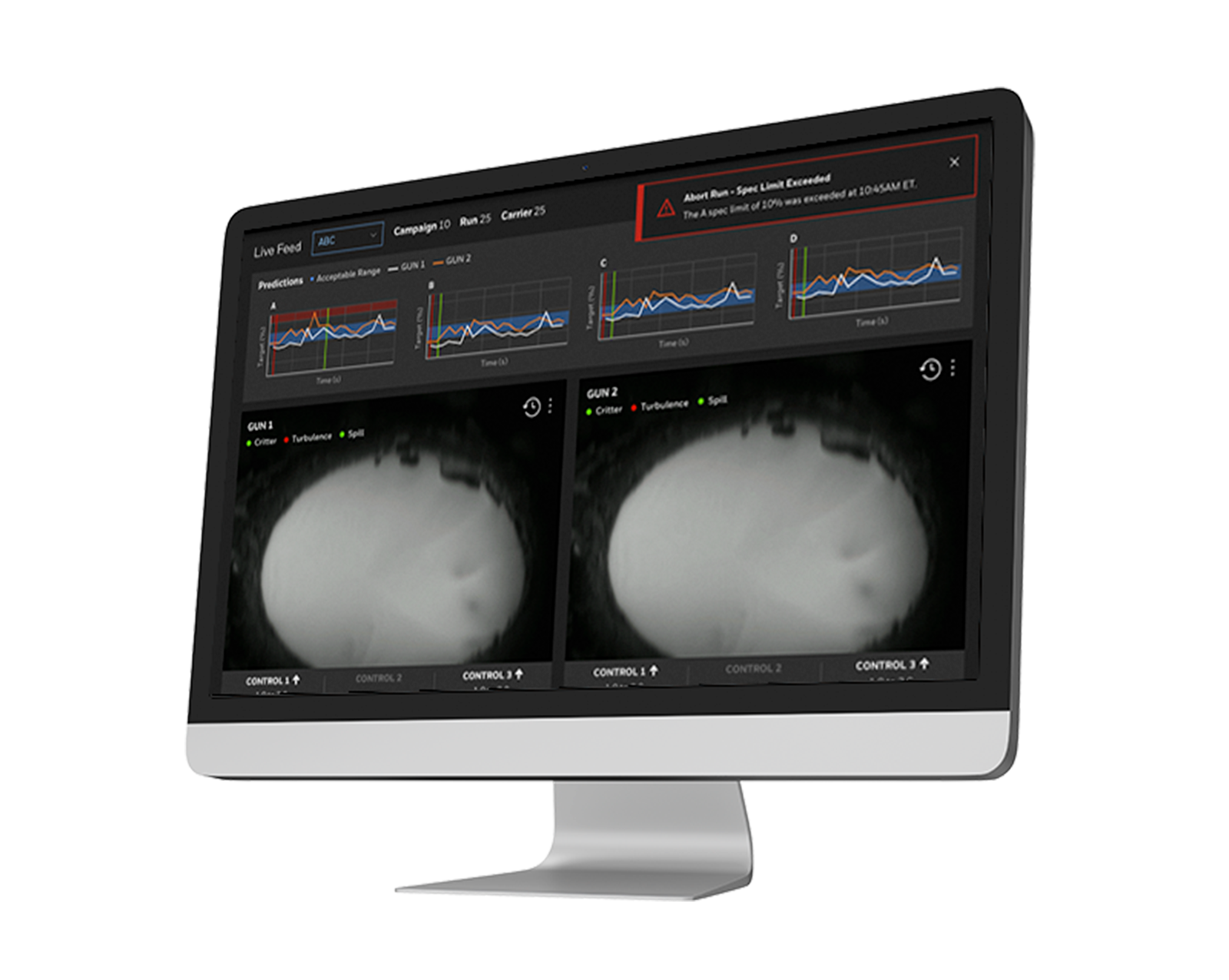
DESIGN
I brainstormed a few versions of the dashboard. Each iteration brought new questions on the task flow and edge cases, for example: how long would it take for adjustments to reflect in the prediction graphs? Would an operator ever need to see historical data?

Version 1 - One video feed and graphs on the right

Version 2 - Two video feeds, control panels and graphs on the bottom
After three rounds, we felt the key scenarios were covered and we could put the prototype in front of users. I populated it with real data from the model and realistic values in the controls to make it feel as real as possible.
Testing
Although a site visit would have been ideal, we planned for a remote focus group due to COVID-19 travel restrictions. The focus group would consist of two parts:
One hour meeting on Microsoft Teams in a meeting room away from the noisy machinery to introduce the dashboard concept; get first impressions and field questions on terminology and interpreting the graphs
Bring up the dashboard on the monitor at the operator’s workstation; ask him to mimic his day-to-day activities but incorporate the dashboard and take notes on legibility, friction points, etc.
outcome
Unfortunately, funding ended up being pulled from all R&D projects due to the pandemic 😞
Keep reading: